Neighborhood analysis
Contents
Concept
The neighborhood analysis is a tool available in Dynamo that is meant to help describe the local spatial relationships of particles, especially after STA. As such, it is implemented in Dynamo as a function that analyses particles through their alignment table.
Aligned particles are described by their euler angles and their aligned position. If two particles are close enough to be considered neighbors, they form a pair. The computation of the relative geometries of all pairs is the neighborhood analysis.
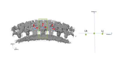
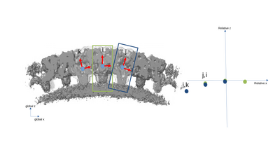
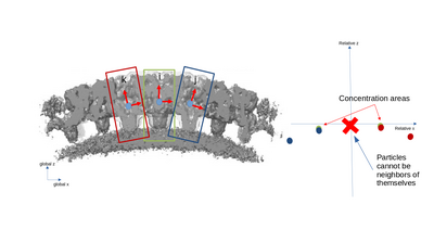
A simplified 2D example with only three particles is presented with the following figures. The left part of the figures represents the real space in the tomogram, while the right graph present the neighborhood analysis space.
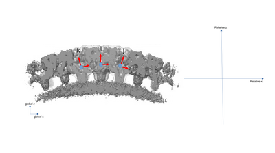
It is important to note that the pair (i,j) is not necessarily a sign flip of the the pair (j,i), even through they express the same distance vector (with opposite sign) in the tomogram. This is because the reference systems of i and j have different independent orientations to each other!
Function call
The most basic way to call the neighborhood analysis function is:
analysisOfmyTable = dpktbl.neighborhood.analize(myTable)
Where myTable is the table describing the set of aligned particle in the usual Dynamo format.
dpktbl.neighborhood.analize has a set of optional parameters:
- distance: this is the maximal allowed distance between particles to still be analysed. The distance is measured in pixels between the centers of the particles after alignment. The default value is 5 pixels. This value should be kept reasonably small, so as to highlight short-range repeating spatial relationships as well as to reduce computing time.
- modelColumn: this indicates which column of the table is used to separate the particles into groups. Particles in different groups cannot be considered as neighbors. The default column is 21 ("reg").
- secondTable: this options changes the behaviour of the function. If this option is active, the distribution of particles defined in the second table will be analysed as seen from the particles in the original table. This option is deactivated by default.
- indices: this options allows for the analysis of only a subset of the groups defined by modelColumn. By default all groups are analysed.
The output analysisOfmyTable is a structure. It contains three main fields: .originalTable, .coupleTable and .couples. .originalTable is merely a copy of the input table. .coupleTable is the table that records the geometric relationships between pairs of particles and in particular the distance vector is recorded in columns 24, 25 and 26 (x,y,z following the Dynamo table conventions). .couples records for each pair the indexes of the corresponding particles in the original table. As such, .coupleTable will have the same number of rows as .couples.tbl.
Visualization
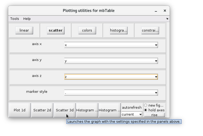
The results of a neighborhood analysis can be inspected in different ways. A practical method is to use the dtview functionality of the output analysisOfmyTable.coupleTable.
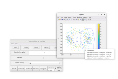
dtview allows for the creations of lassos in 2D scatterplots. This tool can be access by right-clicking the 2D scatter figure. A lasso can then by manually drawn.
The pairs inside the lasso can be saved by righ-clicking a lasso and selecting a "Subtable with points inside of lasso ->" option. If the "memory" option is selected, a variable called mbtblSelection will be created in the MATLAB workspace.
dtview has other drawing options, such as 2D and 3D histograms. However, it is sometimes more convenient to represent a neighborhood analysis has a 2D heatmap in order to to highlight accumulation areas. For an example on how to do so, the x-y heatmap of a neighborhood analysis can be generated by:
nbins=[50 50];
[N,C]=hist3([analysisOfmyTable.coupleTable(:,25), analysisOfmyTable.coupleTable(:,24)],nbins);
contourf(C{1},C{2},N);
xlabel('Relative pairwise X distance [px]');
ylabel('Relative pairwise Y distance [px]');
title(['Heatmap of Neighborhood analysis']);
axis equal;
Example
An in-depth walkthough on the use of the neighborhood analysis is available at this page.
